Friday 27 July 2012

Warm Irises


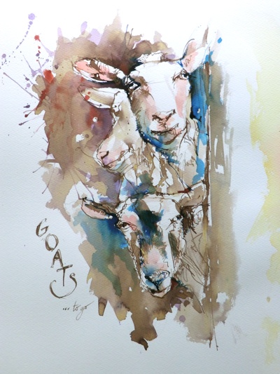
Watercolour and selected acrylic inks on Saunders Waterford Paper

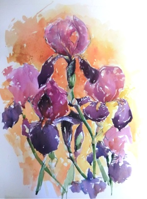
I always try to paint an expressive botanical between more serious studies. They are so freeing and enjoyable. I wanted to bump up the colour so I used some of my new acrylic inks here and there and I think they made quite a difference. Watercolours can dry a little flat and matt for my liking so I can see myself using acrylic inks quite a bit in the future.

I have shown 3 stages to this painting. The first was a light and loose drawing using a cinnamon pastel pencil followed by light washes to fill in negative spaces and get a feel for the subject. I then carried on building up the painting until I was happy with the overall balance of colour and shapes.

Wednesday 11 July 2012

Coffee Morning in Sarlat


Watercolour with light application of Coloured Pencils

This is a painting that I have just completed. It represents one of the busy coffee spots in Sarlat. I used a bit of golden ochre this time as it is slightly opaque and seem to keep its vibrancy. I have a love hate relationship with watercolours in that the colours always seem to dry too matt and seem to loose their vibrancy when dry. There is always the question of when to put that brush down. I enjoyed this study and I will endeavour to do some more old historical buildings and villages in due time.

Tuesday 10 July 2012

Winston


Acrylic Wash and Pastel Pencils on Spectrum Colourfix Paper

I thought it would be interesting to show you the start and finish of this project I did with the Farleigh Art Group (Surrey). He was such a great character with fabulous folds and creases all over the place. The tricky part of the drawing was the placement of the eyes and nose unit, so drawing is still an essential skill, even for those of you who love the loose and lively approach. The tricky area, where tone and colouring were concerned, was the mouth. We had to create more tonal variety to make it believable. Always bare in mind that, even if your reference shows you its own set of tones and colours, your artwork should be balanced with its own set of tones to carry it off. Our illustration was bound to be lighter and unfinished with this combination. 

The first stage consists of a loose pastel line sketch and an acrylic wash with a limited mid tone palette. As you can see, it is enough to frighten any artist so my group displayed a variety of zig-zag smiles at this stage. However, when one adds the pastel layer, which is more controlled and brings in those light creamy tints, then the picture comes to life. One can also be selective as to how much you add. Note that the ears have no pastel finish at all.

I really love this combination. I learn something new each time.

Saturday 7 July 2012

Majestic Tiger


Pastel and Acrylic on Spectrum Colourfix Paper

I always love teaching these workshops where we combine acrylic and pastels. The acrylic wash layer establishes an interesting and expressive underpainting which enables the artist to leave areas unfinished  and to avoid that all too familiar 'chocolate box' finish. The underpainting should ideally be made up of a limited palette and it can appear quite dull in tone. The fresh layer of pastel pencil should restore those brighter values and establish the highlights. It is worth the preparation and patience. 

Goats to Go


Watercolour and Liquid Ink on Watercolour Paper

I'm afraid that my warped sense of humour came to the fore when I completed this illustration during a workshop. The red splatters made the picture look more representative of an abattoir, hence the the macabre label. We did have fun though. Goats make wonderful subjects.

Monday 2 July 2012

Puy L'Eveque - The Lot (France)


Acrylic on Canvas - 130cm x 90cm

What fun I had painting this picture! I am trying to take photographs of the stages en route so that you can see the progression and how the scene developed. I used a very big flat brush most of the time, but particularly at the start. I covered every inch of the white with purple/pink and violet. This stage is very therapeutic indeed. I then blocked in the town having given myself a basic idea where the water line was to go. As soon as I picked up the smaller brushes (which did help for certain details), the painting became too fiddly so I carried on for most of it with my big flat brush. The painting came together bit by bit - with small areas of the underpainting poking through. It is important to step back regularly and think about where you placing your next stroke. I intend to produce a few more in this style this summer.