Monday, 4 April 2011

A Portrait

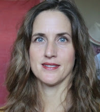
Oil Wipe-Out

We finished our oil project a week early this term so we spent the 5th session trying out the 'wipe-out' technique. It tends to produce interesting results. It is often used for drawing and the underpainting layer for oils. If combined with detailed painting as well, it can look quite incredible.

I used raw umber, cadmium red, terre verte and black to create this image. The paint needs to be thinned with thinners, but not dribbly, so one needs to find the right consistency. If it is too thick, then it is difficult to 'wipe out'. Once your colours are down, start wiping out your biggest, lightest shape and then build the picture from there. I wipe away and then add darker shadows en route. The picture's structure emerges more clearly and is certainly more helpful. One can use brushes, wet wipes, sponges, material, kitchen towel and/or cotton buds to 'wipe out'.

Eve's Little Puppy


Acrylic on Canvas Board

My Mother's friend Eve, sent us pictures of her adorable puppies. I decided to use these pictures for my acrylic workshop with pleasing results. Thank goodness I chose one puppy, instead of two, as they proved to be challenging subjects. Being a light coloured animal, it is easy to make the shades too light. One needs a healthy mid tone and a fair amount of colour to carry the top layers. I enjoyed this project immensely.

Old Namibian Woman

Oil on Canvas Board

Despite this dear woman's expression, she has been such a pleasure to study, both in pencil and in oils. My Friday group did the oil study and we all learnt a lot from it. The results were fabulous. We started by doing a wipe-out in raw umber to get a feel for the measurements and shapes of the face and then we took our time mixing 3 tonal groups of flesh colours. These formed the basis for our face. Whilst they were drying we went on to do the headscarf. We applied the paint using big strokes using thick paint to give the impression of folded fabric. It is even more important to have colours premixed (shades of white) in order to achieve the 3-dimensional feel of her head. The pattern on the fabric is so important as it also helps to create the shape.

We then put our background colours in which influence the flesh colours and allow one to then apply those discord colours onto the face (second layer). The purple clothing also helped to balance the background and face. It is very important to work on the whole painting even if areas are slightly unfinished.

Male Statue at the V&A

Acrylic and Pastel on Mountboard

The V&A in London has many treasures to choose from if you are an artist. This particular male bust offered so many juicy contrasts and edges that he was irresistable. He is made up of bold surfaces that catch the light or are in shade.

He is also a combination of acrylic and 'acrylic ground for pastels' and soft pastel sticks. I have described the method in more detail in the post which follows this one. It is a quick method and I was very pleased that it came together as it was a tricky choice for an art demonstration. Those carefully placed highlights and shadows brought him together once I had spent some time on the mid tones.

Petra

Pastels and Acrylic on Mountboard

The buildings in Petra are spectacular. The sheer size of these majestic fazades take your breath away. The light also benefits the painter or photographer and if you get there at the right time you can accumulate some stunning references. I chose this view of the Treasury for my demonstrate for the Spectrum Art Group this year.

You first prepare the surface of the mountboard with a mixture of acrylic paint and 'acrylic ground for pastels' which creates a sandpaper tooth on the board. Use a big DIY brush for the job. It is up to you what colours you use for the background - one can go for a dramatic affect. Whatever you do, don't smell the 'acrylic ground' - it will burn your nostrils!

Once your background has dried (not long), you create your picture using chalky or soft pastel sticks. This is when your highlights will bring your picture to life - an expressive and suggestive way to work.

Vibrant Irises

Acrylic on Canvas Board

I do love irises. The flower is like a wonderful ballgown from Strictly Come Dancing. I am never disappointed when I paint or draw irises - they seem to encourage one to paint with expression and gay abandon. Whether white or colourful, they will hold your attention throughout the creative process. I used a series of big round acrylic brushes to paint them and the colours evolved as I was painting. One does not always need to be so representational.

Young Girl in the Shadows

Charcoal, black pastel, white pastel and Sanquine on tinted paper

This photo reference of a young girl was passed on to me by one of my students who knows that I love dramatic portraits. I decided to try this combination with my Saturday group as they love their pastels. It is a wonderful exercise, as it teaches one to identify the three main tonal groups and to simplify tones into shapes. The result is far clearer than one could imagine.